BIG architects designed this beautiful museum in 2013 and it has been a lot on my mind lately. I am just so in love with the facade system and the design of the museum itself. What a great design.

It is not for nothing BIG has become the most popular and sought after architect office in the world.
I was first exposed to the project and all its details in 2015... if i remember correctly and fell in love with it... that does not happen to me with just any nice looking building.
It was in 2013 that BIG was announced the winner of an international design competition for the new Cité du Corps Humain (Museum of the Human Body) in Montpellier. Rooted in the city’s long medical history and world renowned medical school, which dates back to the 10th century, the 7,800 sqm museum will “explore the human body from an artistic, scientific and societal approach through cultural activities, interactive exhibitions, performances and workshops.”

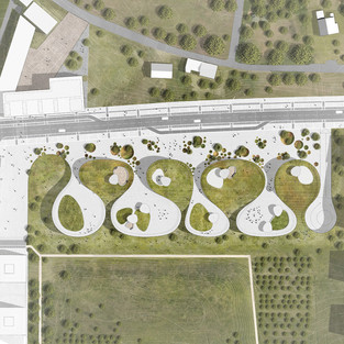
It’s design, orchestrated by eight undulating forms which “weave together” to create an underlying continuous space. Stunning views, access to daylight and critical internal connections will all be revealed by the Museum’s shifting form.'
“Like the mixture of two incompatible substances – oil and vinegar – the urban pavement and the parks turf flow together in a mutual embrace forming terraced pockets overlooking the park and elevating islands of nature above the city. A series of seemingly singular pavilions that weave together to form a unified institution – like individual fingers united together in a mutual grip,” explains Bjarke Ingels.

The museum’s roof functions as an ergonomic garden – a dynamic landscape of vegetal and mineral surfaces that allow the park’s visitors to explore and express their bodies in various ways – from contemplation to the performance – from relaxing to exercising – from the soothing to the challenging.

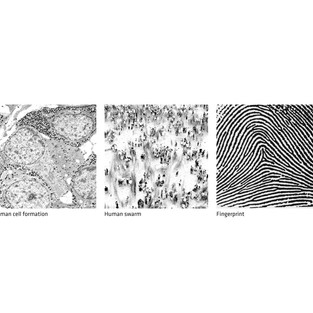
The façades of the Museum of the Human Body are transparent, they are as we call it designed with parametric design. That is, parameters such as the sun in this case and orientations are used to measure and design each louver precisely to provide the shades needed and to maximizing the visual and physical connection to the surroundings. On the sinuous façade that oscillates between facing North and South, East and West, the optimum louver orientation varies constantly, protecting sunlight, while also resembling the patterns of a human fingerprint – both unique and universal in nature.
One of my favourite projects by BIG architects, I hope it will one day see the light of day in more than beautiful visuals.
Here are more pictures:


Comments